Bias Lighting
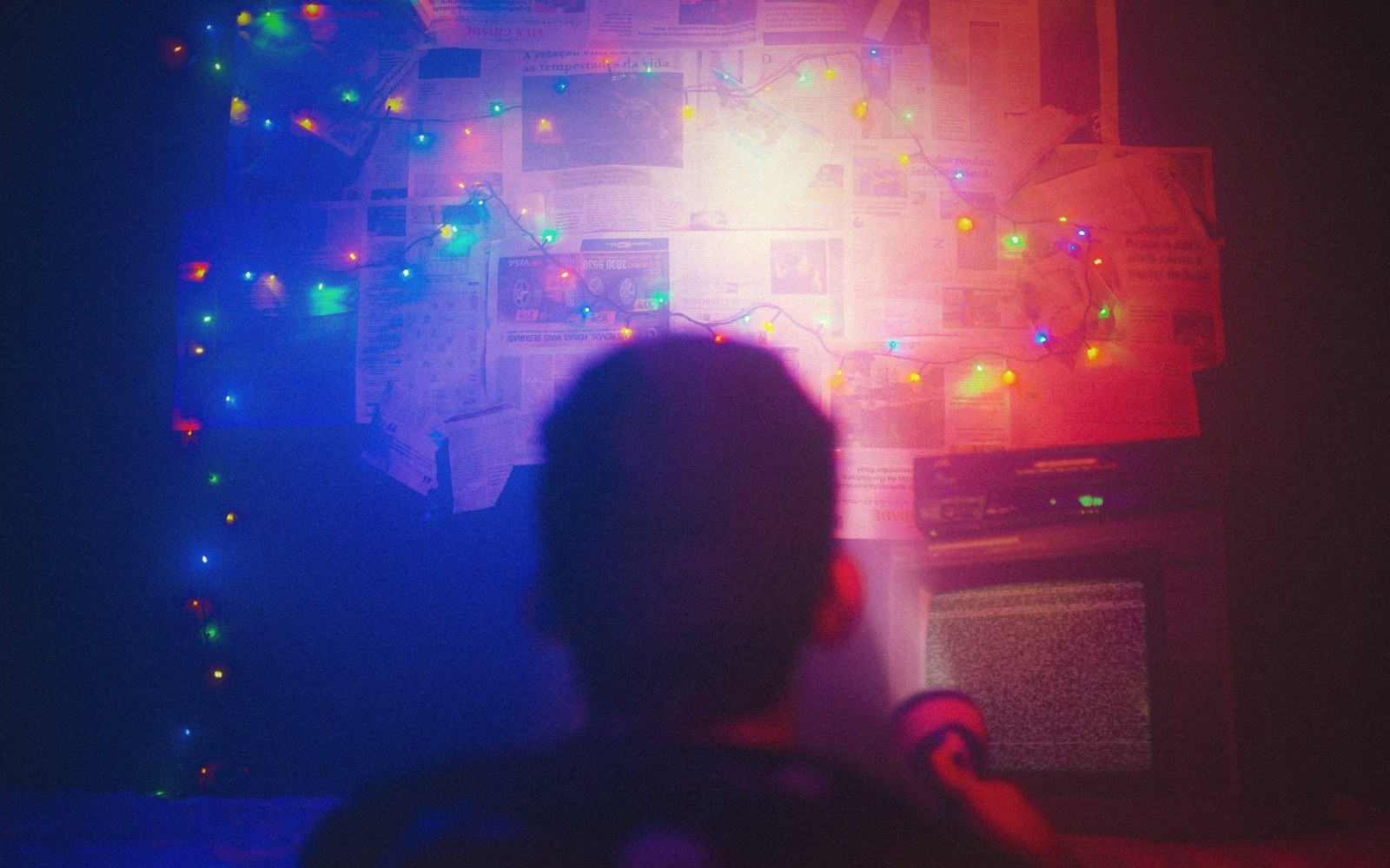
Fig. 01 · A little controlled light behind the screen buys comfort without landing on the panel. · Photo: Matheus Bertelli / Pexels
A small light behind the screen raises the apparent contrast of the picture by giving your eye a mid-level reference instead of a dark void.
- The trade-off
- A slightly brighter room for markedly less eye strain.
- Which way to spend
- Spend on one dim neutral source behind the screen.
The Paradox Is the Point
Your visual system does not measure luminance the way a meter does. It judges relative brightness — how much brighter the peak white is than its surroundings. A screen floating in complete darkness looks harsh and uncomfortable because the eye is simultaneously trying to adapt to two extreme states: the near-black of the room and the full brightness of the image.
Add a dim light behind the panel and you raise the ambient level just enough to meet the image partway. The eye stabilises, perceived contrast improves, and eye strain drops.
The light needs to be on the wall behind the screen, not in the room generally. What you are engineering is a local surround field — a glow that fills the visual periphery while you watch the image, not a general lift to the room's light level.
General room light raises the black level by bouncing off the screen surface; bias light, correctly positioned, does not hit the screen at all.
The target colour is D65 — the white point that virtually all consumer content is mastered to, roughly 6500 K. This matters because the surround field becomes a reference.
If it is warmer than the image's white point, whites on screen will read as cool and slightly green; cooler, and skin tones will shift warm. You are calibrating the room, not just decorating it.
2
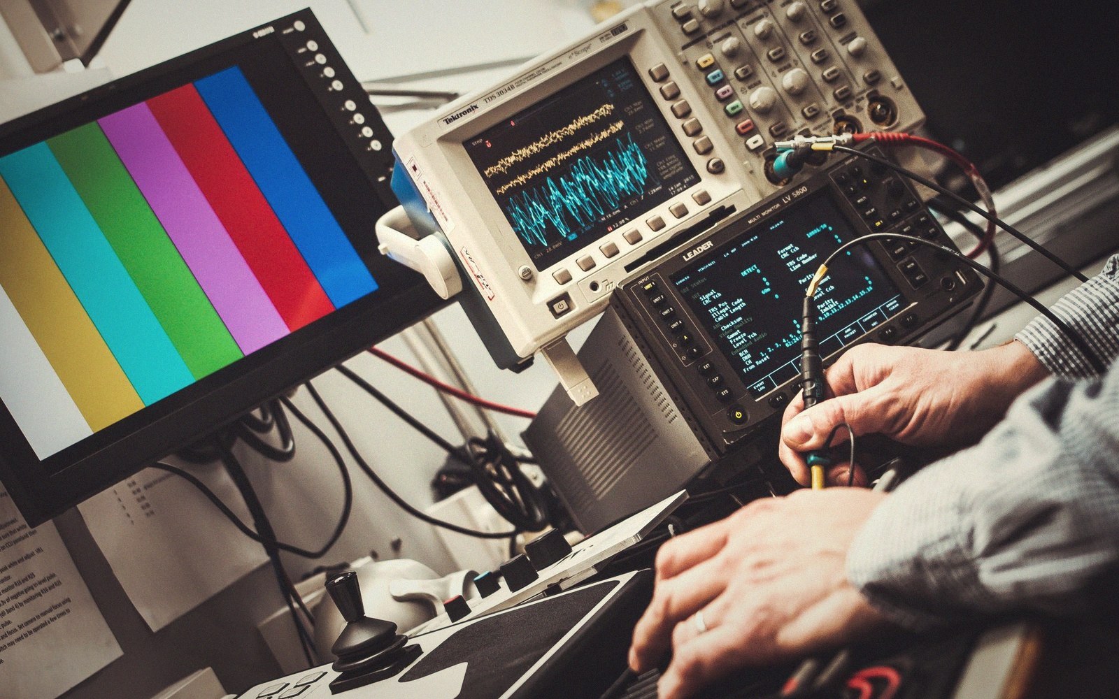
Every reading is taken off the panel itself, in the light the room will actually have.
Photo: Alexander Dummer / Pexels
Brightness is equally specific. The standard, derived from SMPTE and ISO recommendations for professional monitoring environments, puts the bias light at roughly ten percent of the display's peak white measured at the screen surface.
Too dim and it fails to register as a genuine surround; too bright and it competes with the image rather than framing it. In practice this means a very modest output — the wall behind the panel should glow, not illuminate.
Coverage matters too. Uneven glow creates a gradient across the wall that the eye reads as a colour cast. The practical solution is a continuous strip around the panel's perimeter rather than a point source at one edge.
If the wall is textured or strongly coloured, it will tint the reflected glow; a neutral mid-grey or white paint directly behind the panel is the honest choice. Wall colour is never neutral by accident.
The effect is not subtle once you have lived with it. A correctly biased screen in a dark room allows a lower overall brightness setting on the panel — which helps with black floor, heat, and longevity — while still reading as punchy and high-contrast to the eye.
The physics is simple: you are giving the visual system a resting point, and it rewards you by making the picture look better than the numbers alone would predict.
Lifted out of the flow — Light in the Room
The calibration numbers
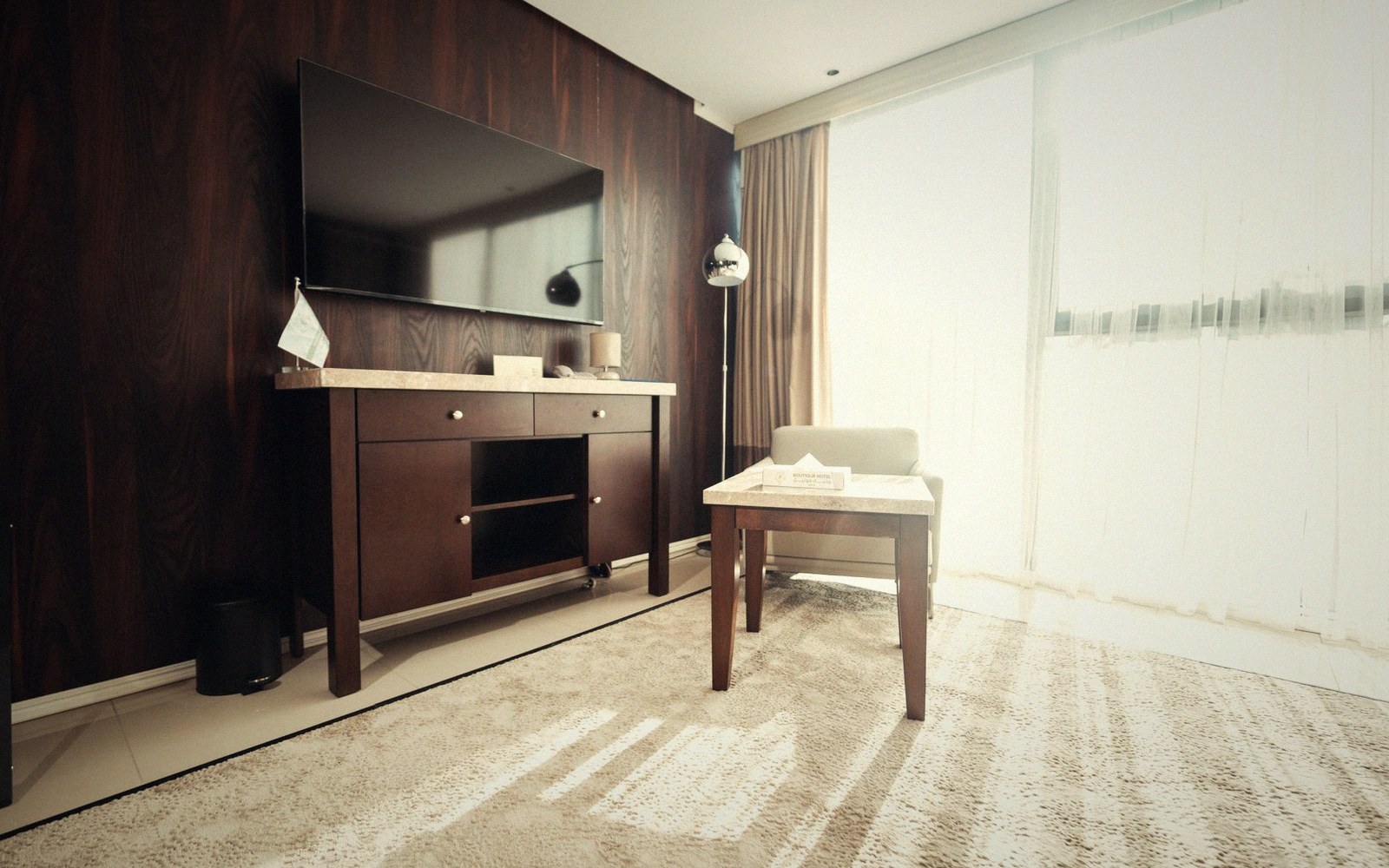
A little controlled light behind the screen buys comfort without landing on the panel.
Photo: khezez | خزاز / Pexels
In practice this means a very modest output — the wall behind the panel should glow, not illuminate.