Wall Colour
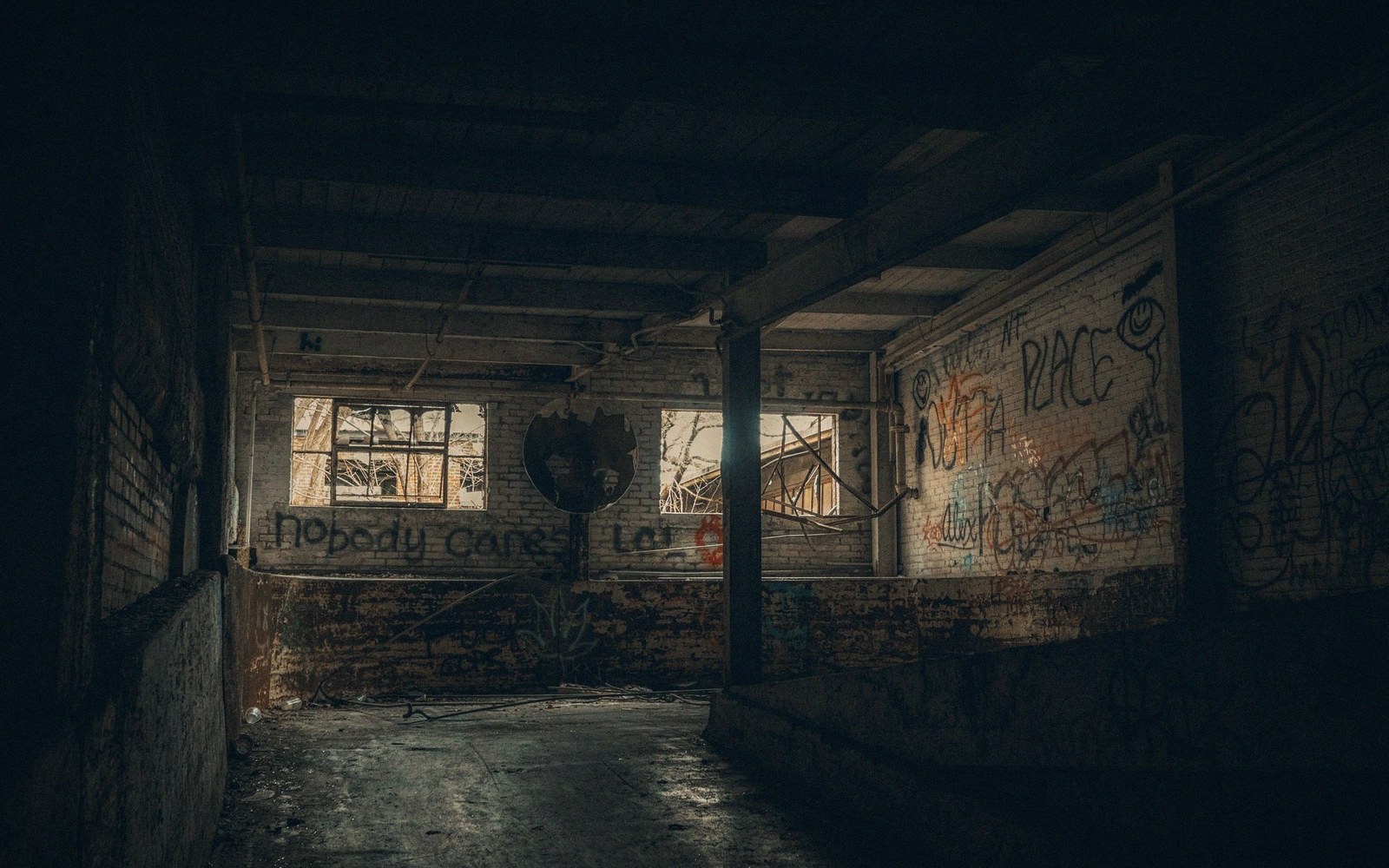
Fig. 01 · Every surface facing the screen returns some of it. · Photo: Mike Norris / Pexels
Every surface facing the screen is a secondary projector. Choose the wrong colour and you are calibrating against yourself.
- The trade-off
- A bright, pleasant room against a picture with depth.
- Which way to spend
- Spend a tin of dark matte paint on the screen wall.
The room is always in the picture
Paint reflects. That is not a preference issue — it is physics. Light leaves the screen, strikes the wall, and some fraction bounces back toward the screen and toward your eyes.
In a dark room, that reflected light raises the black level everywhere on the panel it reaches, crushing the contrast ratio you paid for. The brighter or more saturated the wall, the worse the problem. A warm cream wall does not just look warm; it colour-shifts the shadow detail in everything you watch.
The geometry matters. Side walls close to the screen are the worst offenders because they sit squarely in the cone of light. A surface two metres from a large display and painted a mid-tone colour can reflect enough light to be measured at the seating position — which means the room is doing real damage to the black floor before you have touched a calibration setting.
Saturation is the second variable. Neutral grey of the right value is almost always correct. Not white — white is a mirror by comparison — and not a deep colour that will tint shadows and midtones toward its own hue.
Neutral dark grey absorbs the most light and introduces no colour cast. If the room cannot be dark (a common constraint), the priority shifts to saturation first: a dark green is better than a bright green, but a dark neutral is better still.
2
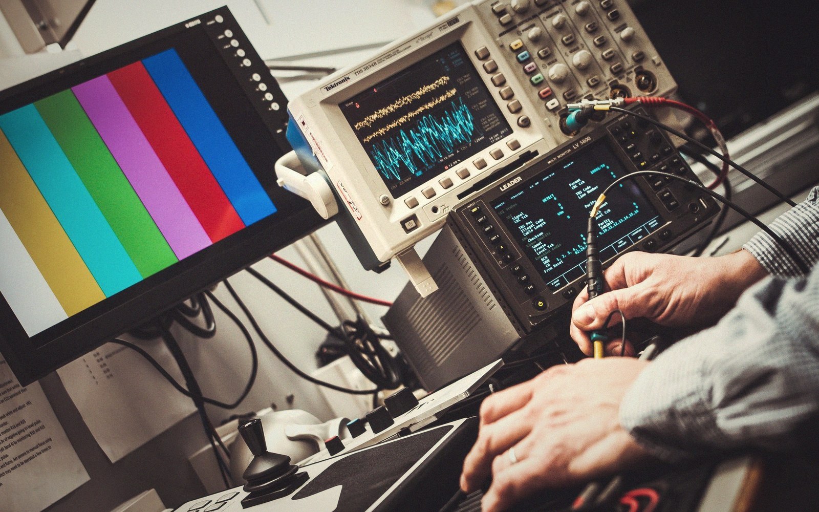
Every reading is taken off the panel itself, in the light the room will actually have.
Photo: Alexander Dummer / Pexels
Ceiling and floor matter less, but not zero. A white ceiling behind and above the viewing position is low risk; a white ceiling directly above the screen becomes a secondary reflector for high-output displays.
Flooring below the screen is illuminated during bright scenes and that light bounces up into the room. Dark flooring in the front third of the room is worth having.
The short version: treat every surface facing the screen as if it were a dimmer for contrast, because it is.
Lifted out of the flow — Light in the Room
Key relationships
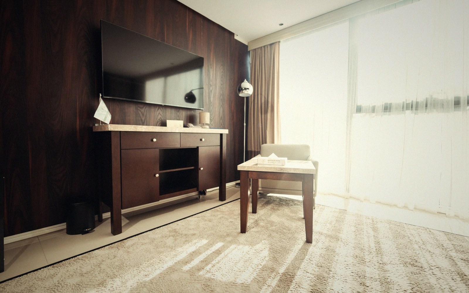
Every surface facing the screen returns some of it.
Photo: khezez | خزاز / Pexels
Flooring below the screen is illuminated during bright scenes and that light bounces up into the room.